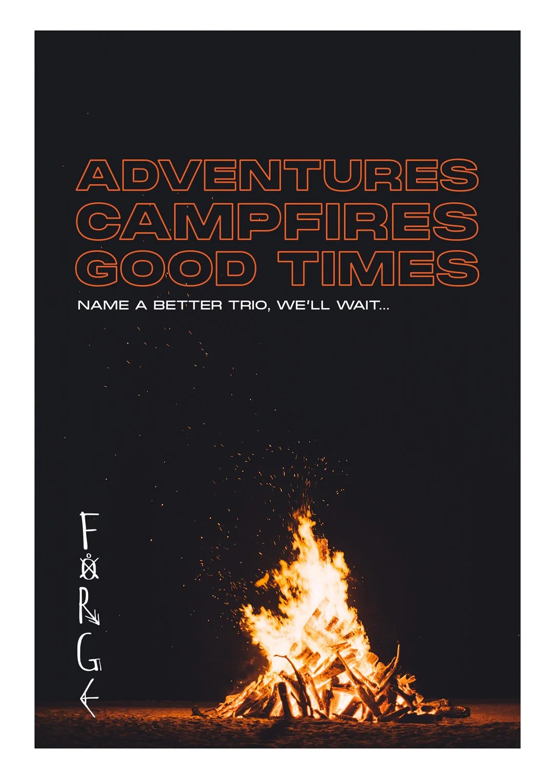
FORGE – Brand Identity Design
A Visual Identity Born from Appalachian Grit and Outdoor Spirit
The Challenge
Building a brand for the outdoors is more than just leaning into nature—it requires capturing a mindset. FORGE needed a visual identity that could stand tall in a crowded outdoor market while honoring a specific regional heritage: the rugged, untamed beauty of Appalachia.
The challenge was to create a brand that felt both timeless and raw—evoking the spirit of those who choose the harder path, the deeper trail, the transformative journey.
The Truth
FORGE isn’t just about gear or trails. It’s about what happens to you out there, the resilience, the solitude, the growth. The brand needed to embody more than adventure; it needed to represent transformation.
Rooted in the Appalachian Trail and inspired by Native American history in the region, the identity had to strike a careful balance: honoring cultural heritage, celebrating nature’s grit, and appealing to a modern, adventure-minded audience.
The Work
The creative direction focused on building a brand that was bold, grounded, and symbolic.
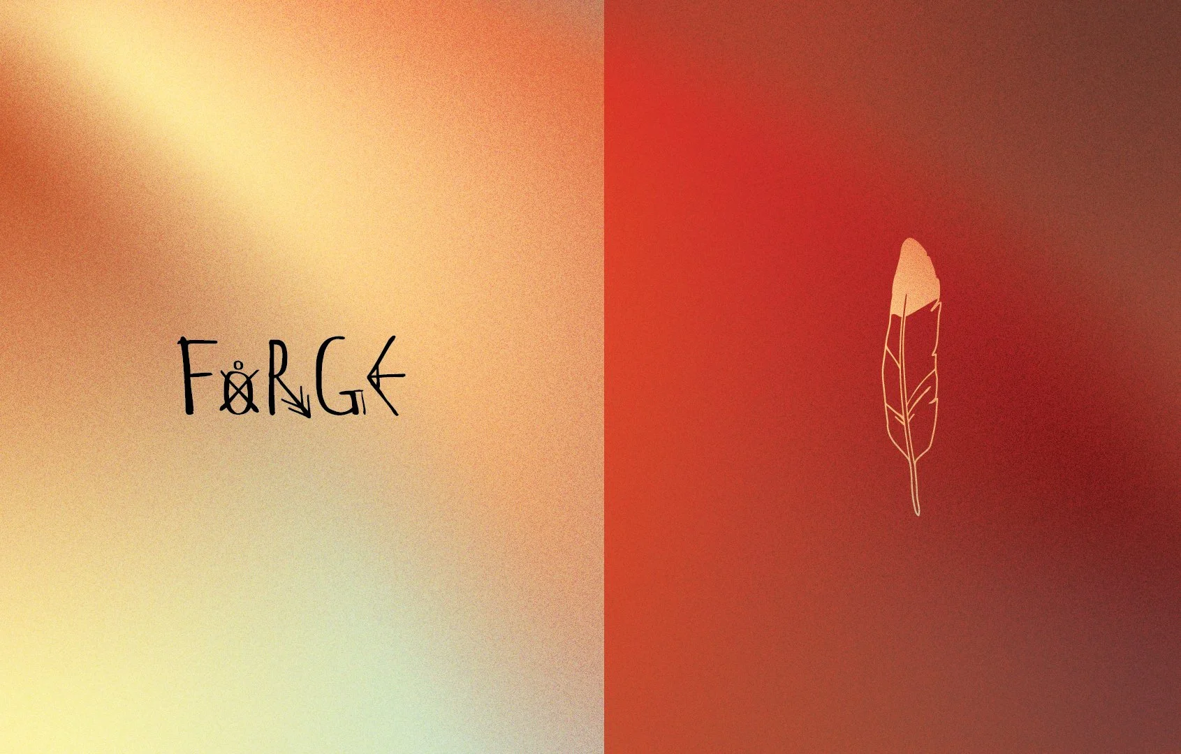
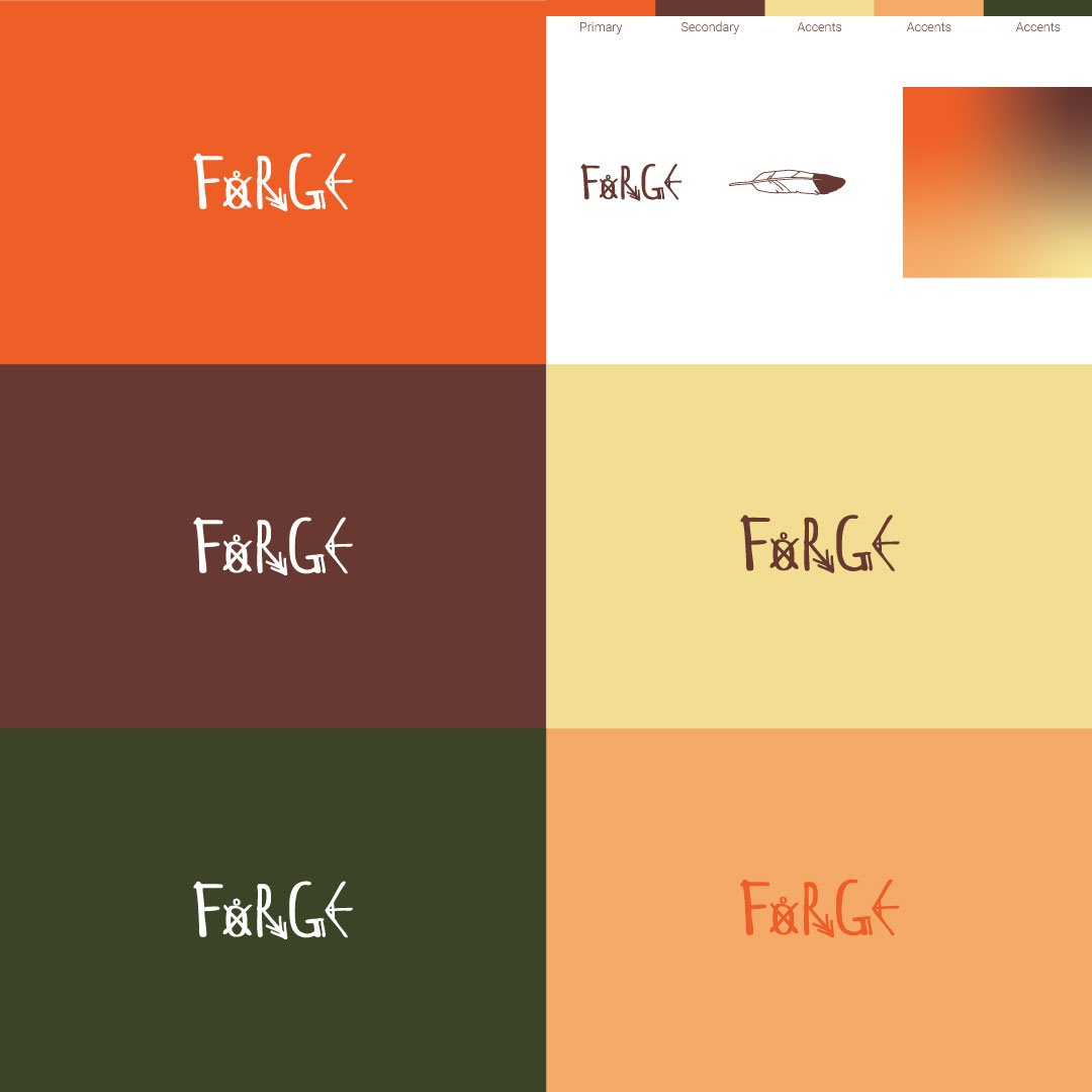
The logo drew from iconic Appalachian Trail symbols, clean lines, carved shapes, and timeless geometry.
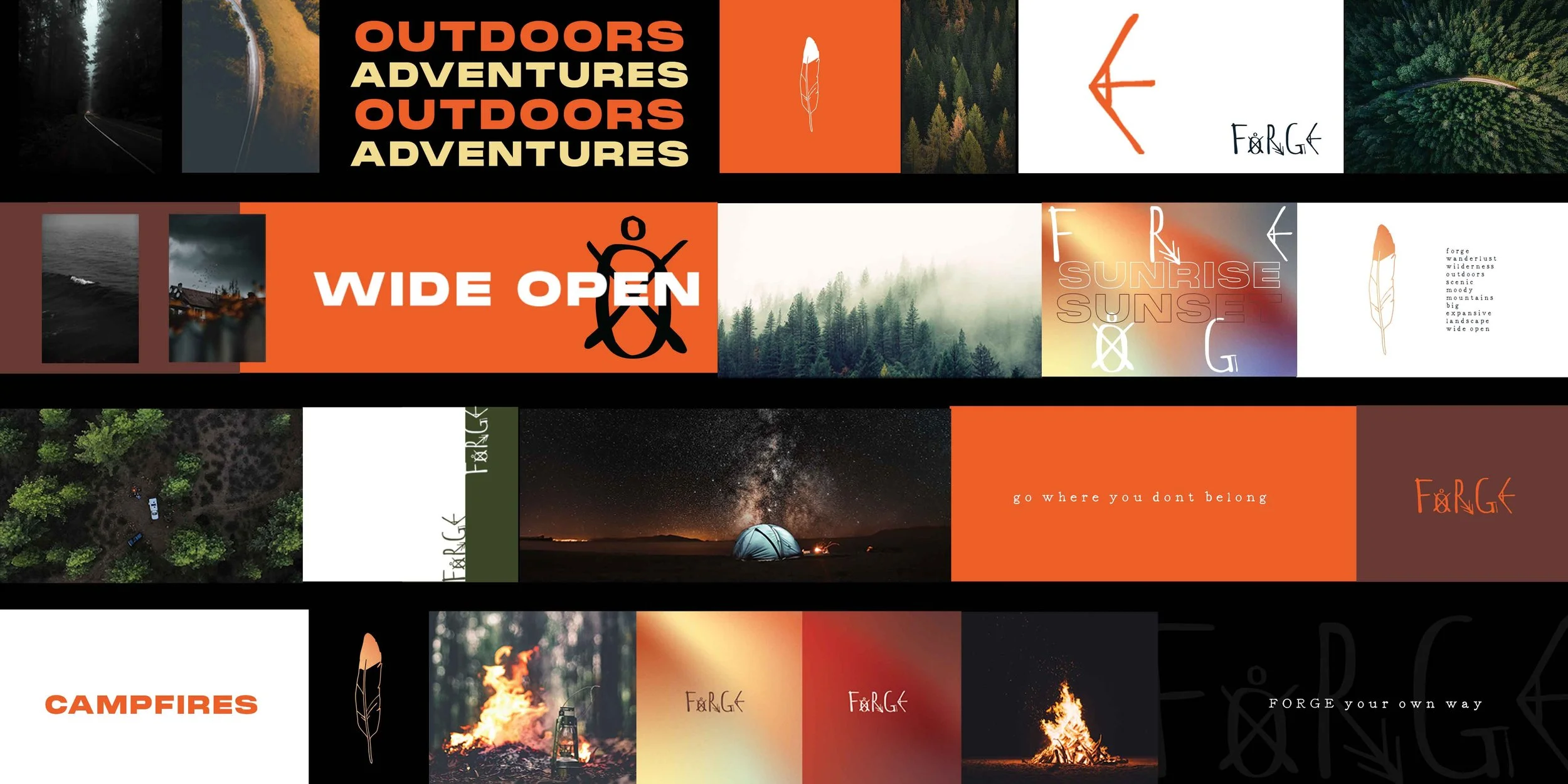
The visual system used natural textures, earth tones, and organic typography to reflect the environment, dusty trails, forest shadows, firelight at dusk.
Cultural reverence was woven into the design through subtle nods to Native American patterns and natural materials, giving the brand depth without appropriation.
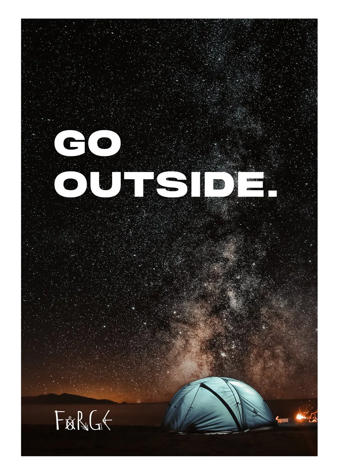
The overall tone was one of strength, reflection, and purpose; never flashy, always intentional.
The result was a brand that feels earned, not just designed, but built for people who live to forge their own way.
The Results
FORGE emerged as a deeply resonant identity rooted in place, powered by purpose, and ready to scale with a loyal, values-driven audience. The brand's look and feel struck a chord with outdoor enthusiasts who don’t just seek adventure; they seek meaning in the journey.

